As a practice exercise, I tasked myself with creating a rebrand for Forbidden Planet International in an effort to create a more uniform brand identity.
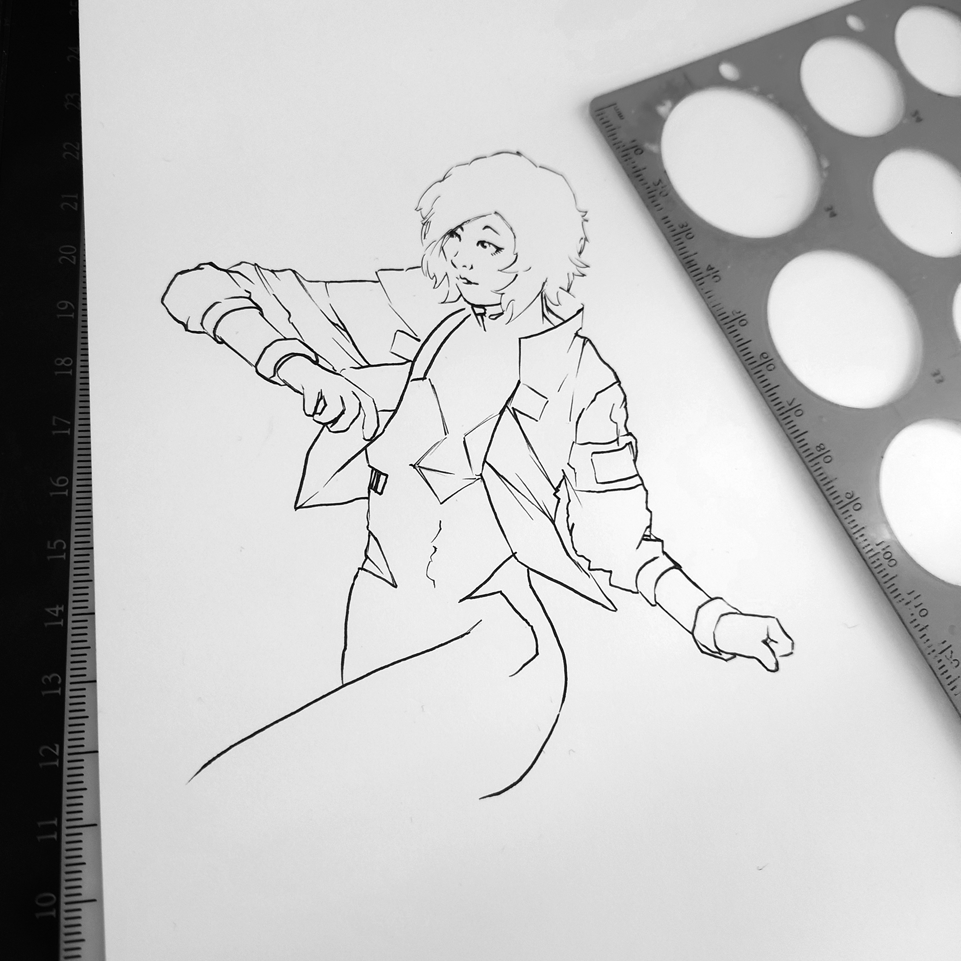
My main thought for this study would be to base the main imagery around an illustrated character, which could be drawn in a number of poses and potentially styles, depending on the content and context in which it was being used.
Using the name "Forbidden Planet" and the existing logo colour scheme, I came up with the design you see here.
As a company that benefits greatly from creative people, such as artists and writers, through the products they sell, it seems fitting to have their own character to use.
With a substantial rise in AI images and the backlash many companies have faced using them, a traditionally drawn mascot would help show support with artists as well as give a recognisable face to the company that often feels lost when compared with another company that shares its name.
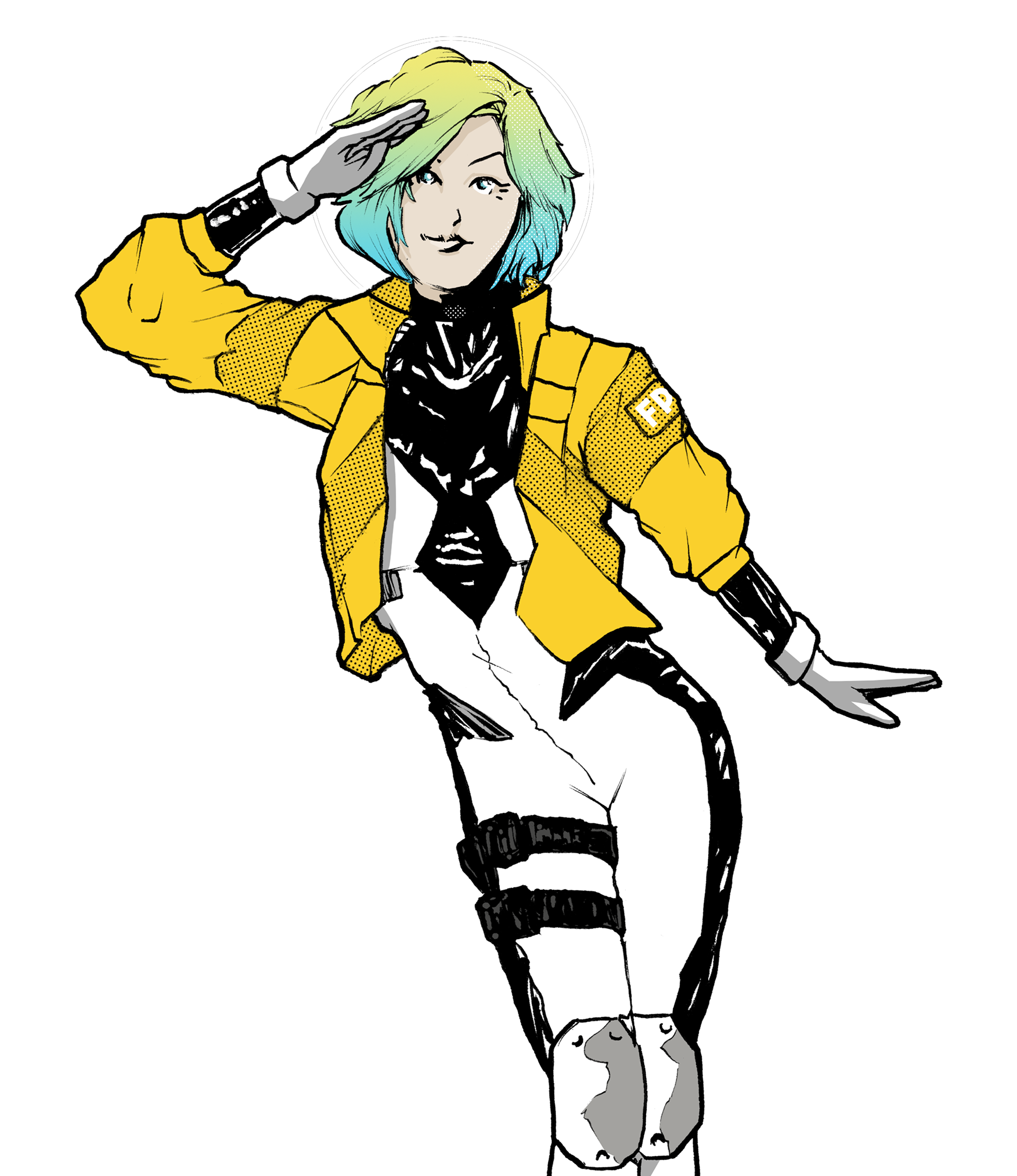
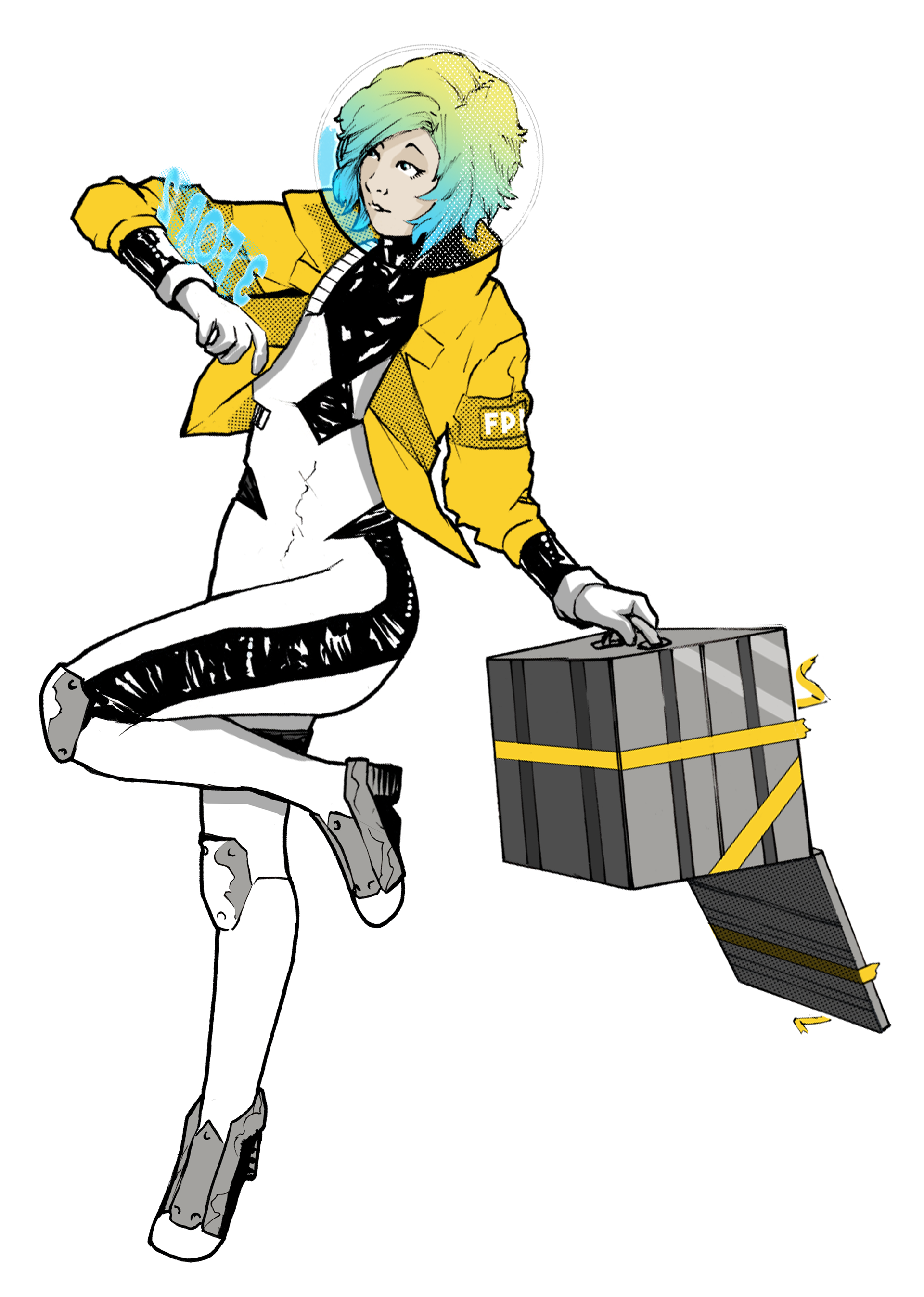
As a company that uses a mail order system directly from its many stores as opposed to a central website, I thought having a delivery person would be a good example of that service they provide, while also being an astronaut to fit into the existing brand established by the company name.
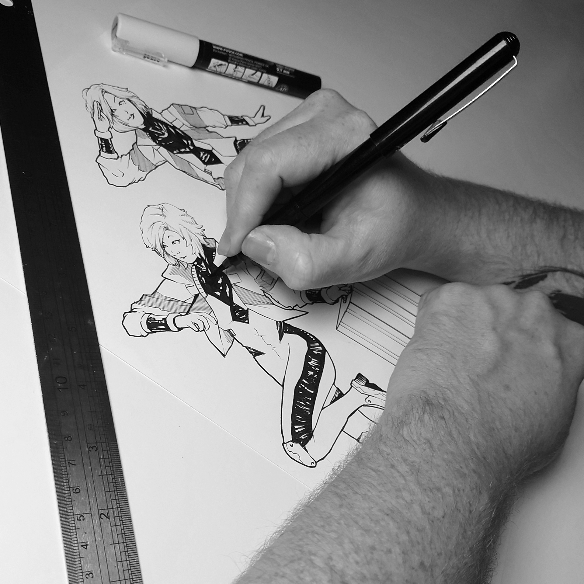
With manga being one of the bigger sellers in the stores I wanted to use screentone paper on, the illustration as this was used on traditionally drawn manga to apply textures and shadows before digital art became prevalant.
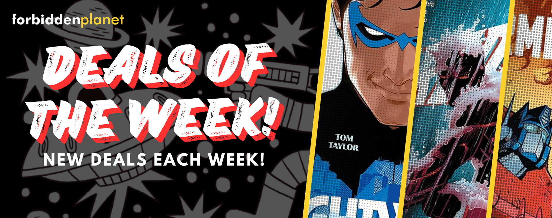
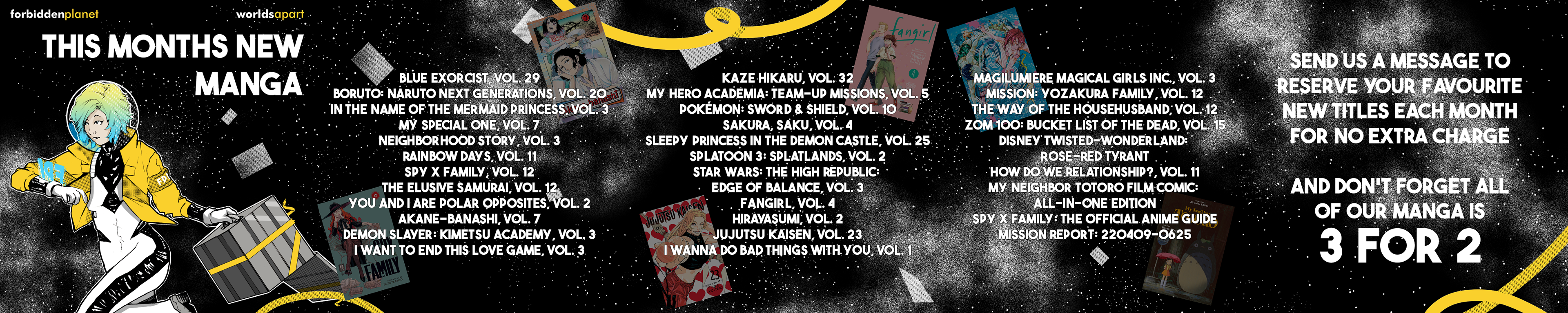
My main goal was to create a series of templates that could be used across social media for a digital marketing team to adapt for any use.
Using what I know from working directly in a store and what was most often needed, I made a series of Instagram 'carousel' posts and an animated Instagram story advertising the mail order service, as well as a list of upcoming manga for the month, which is available online but not currently through the store's social media pages, despite being one of the top sellers.
With simple animations to imitate the books floating through space that could easily be swapped out each month using the template, it keeps the theme running that I used when designing the character.

Featuring the character at the start of the post creates an instant recognition to lead people in before they scroll onto the next post.
By using several images instead of one to post, they can have a shorter message in a larger, attention-grabbing font that will entice people to swipe to see the rest of the information.
My plan going forward with this design would be to create larger in-store signage with the character featured so when people see the social media posts and newsletters, they recognise it from their visit to the stores.
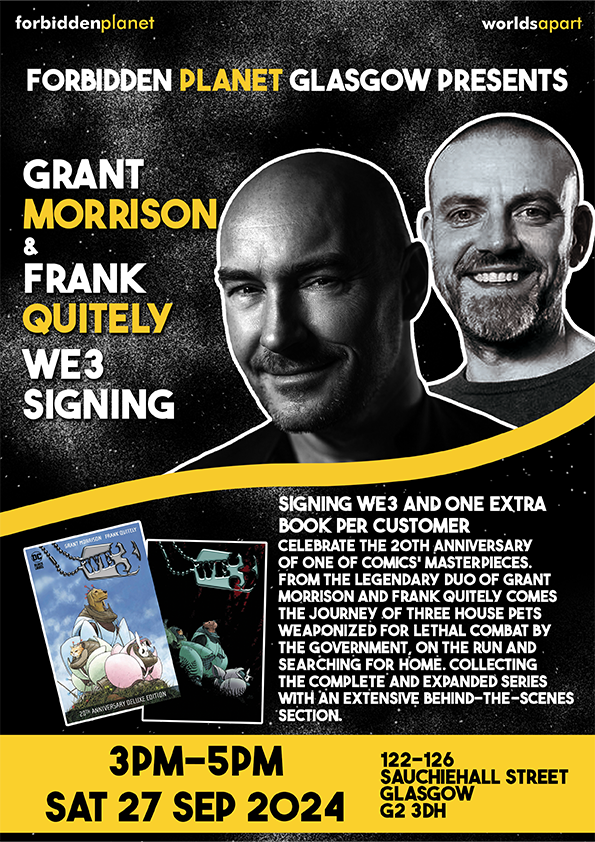
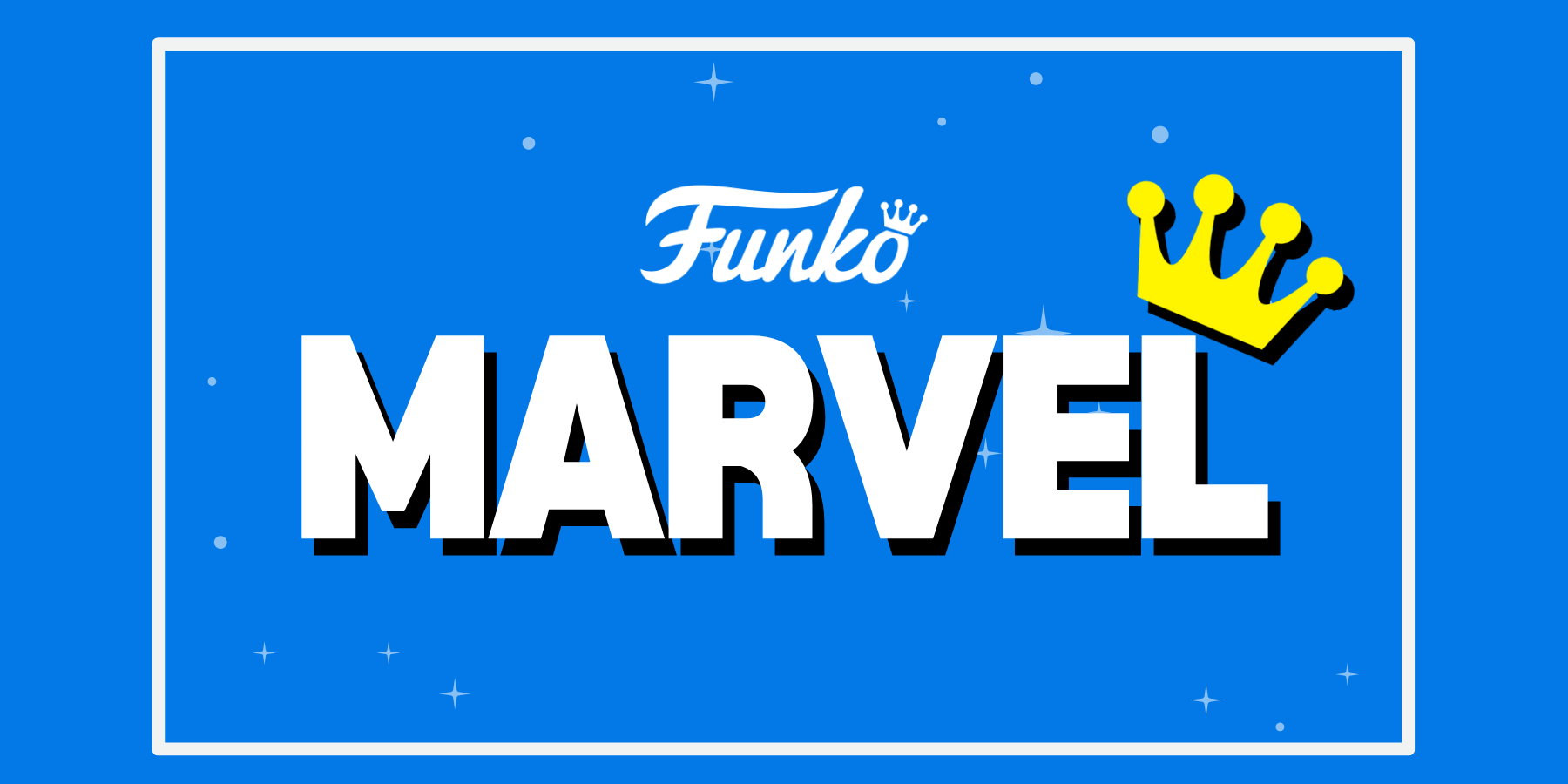
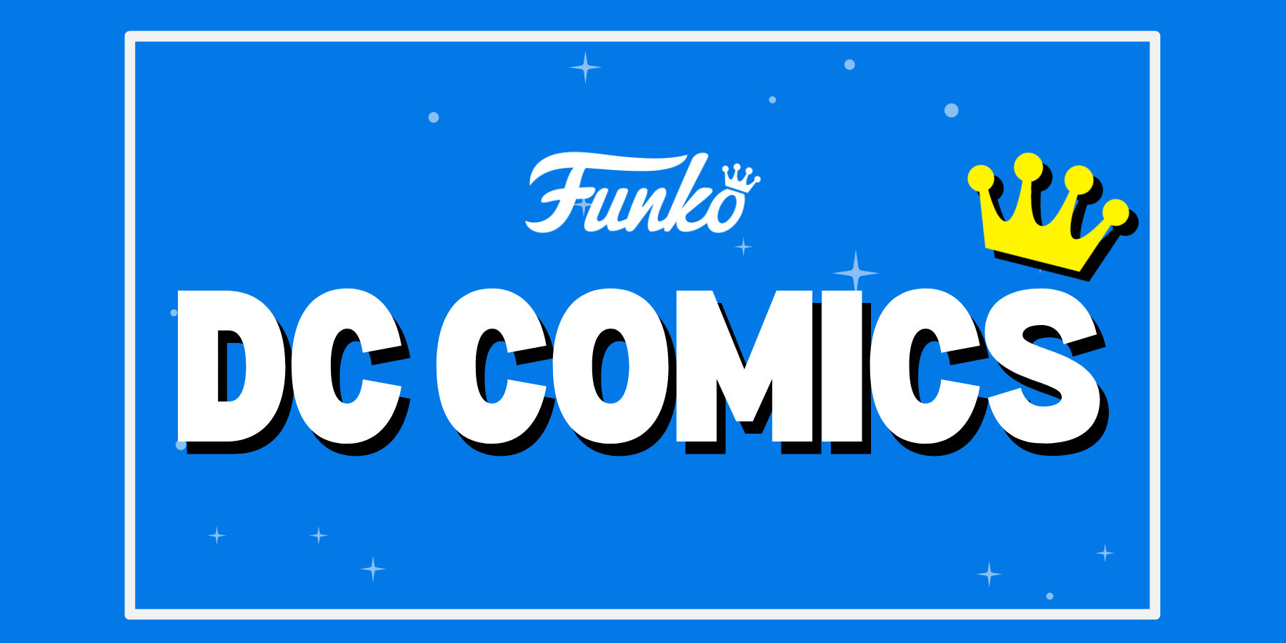
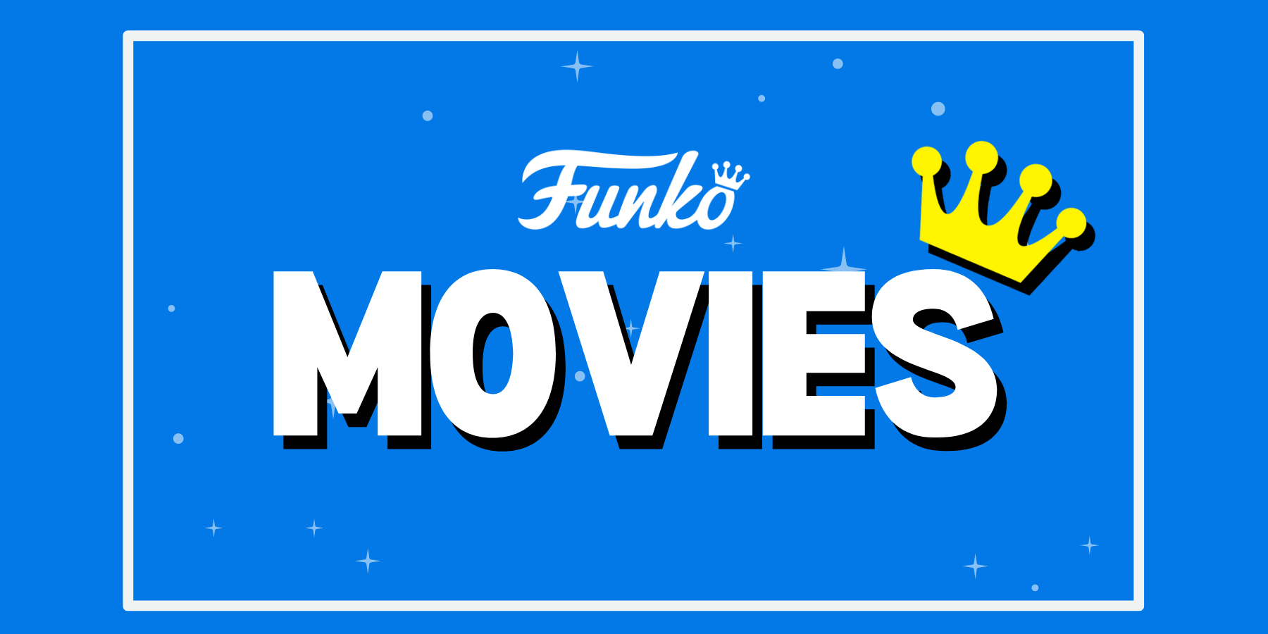
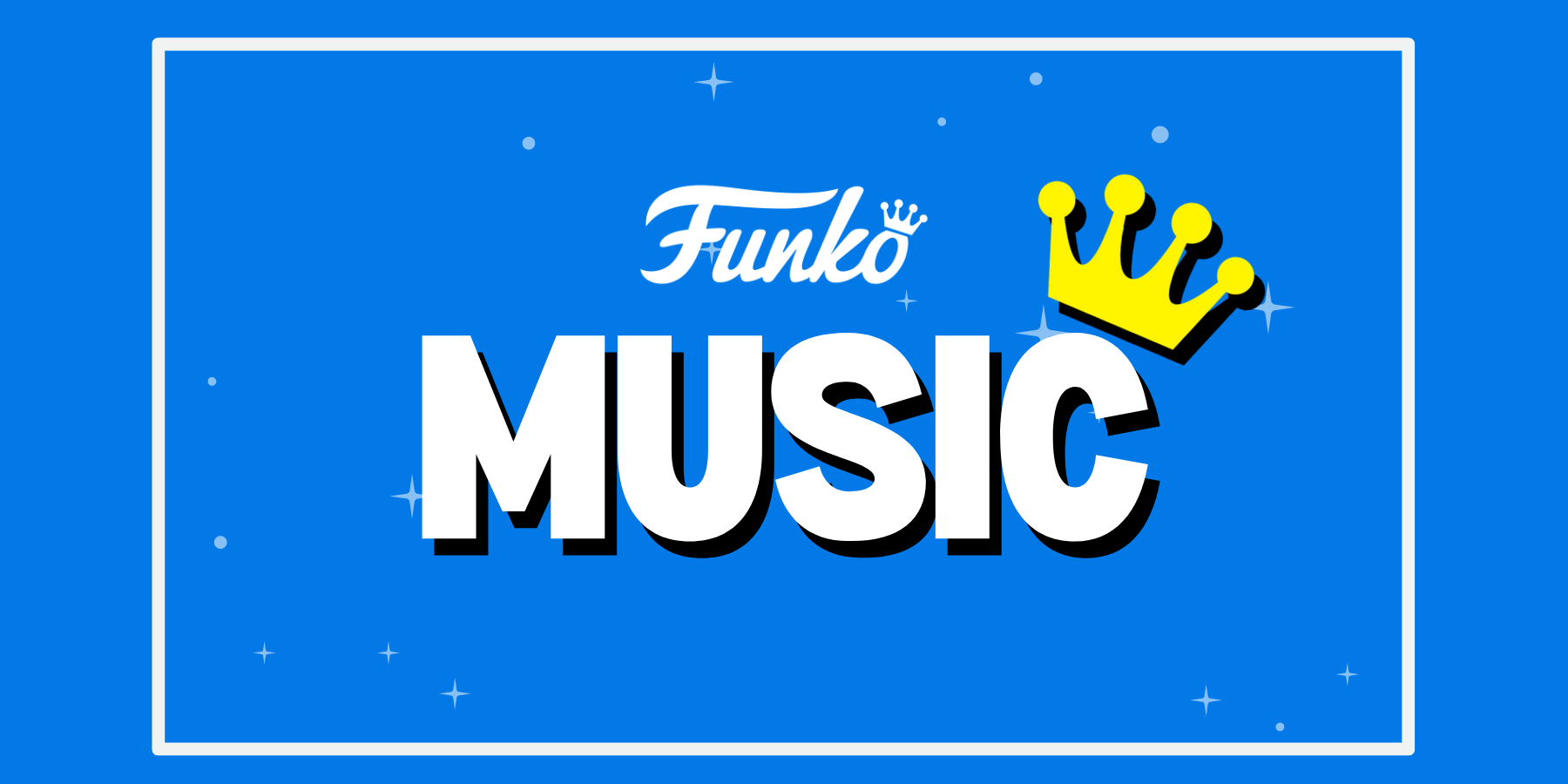
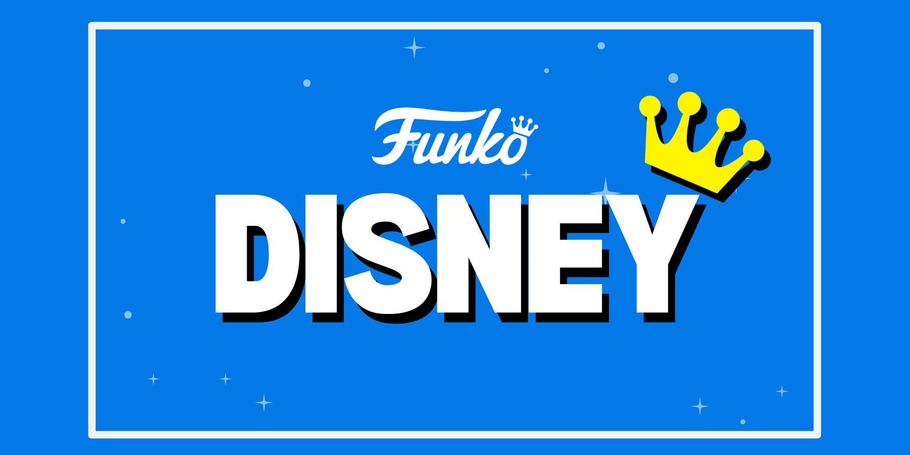
I would also create collaboration illustrations with brands associated with the stores, such as Funko, Loungefly, and Bandai. Giving the opportunity for other companies to help share the new design.

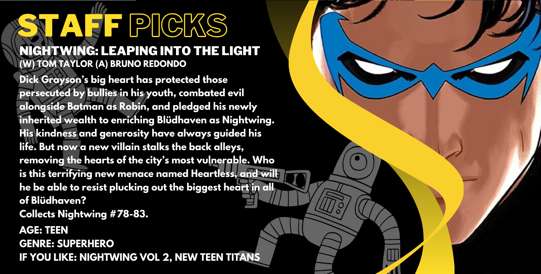
While working at Forbidden Planet I was often tasked with creating in-store signage such as posters or shelf talkers
I worked with existing assets to create images using the approriate logos and imagery to maintain a consistent brand identity as you walk through the store.


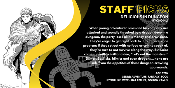
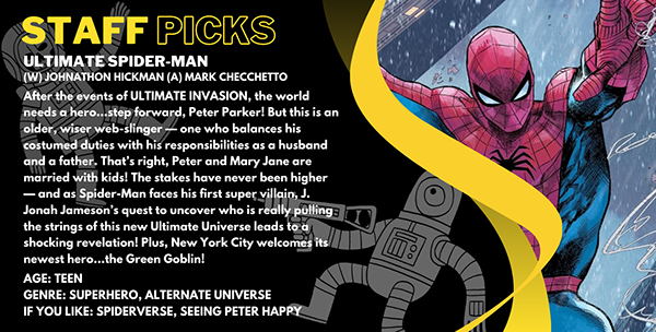
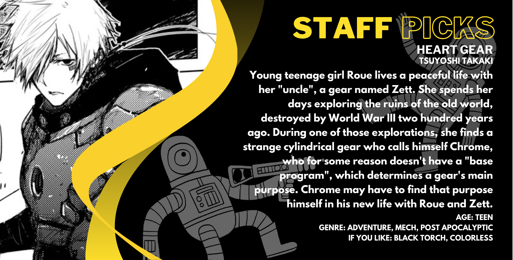
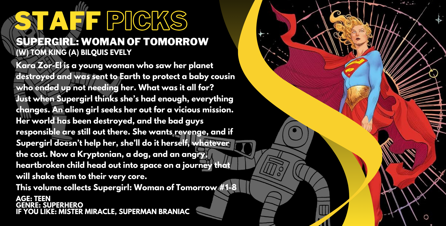
I also created a series of templates for use among the stores for staff recommendations for manga and graphic novels. With age ratings and suggestions based on similar titles, the designs were shared via Canva with a frame for people to drop artwork in and clearly marked text boxes as templates.
I designed the recommendations to be read from left to right for the graphic novels and right to left for the manga.